
Typefaces: why they are important and tips on choosing the right one for your band
Recently I bought a new pair of glasses. A pair that are a little bit more ‘out there’ than some of my previous spectacles. When I say that, I mean they are big and goofy and more in line with something that Clark Kent would sport than my more restrained, sensible eyewear purchases of yore. And to be honest, they are my sole nod to fashion. The rest of me looks as scruffy, non-descript and as ignorant of the latest trends in clothing as ever, but – oh! – you should see my eye-area. It now looks totally at home in any Dalston bar full of hip-spectacle-wearers that you care to mention. The top of my face has become fashionable; it looks like somebody has done a professional job on styling it.
I’m tempted to just leave this article at that, leaving you in awe of my spectacle-purchasing decisions and imagining what my improved eye-area looks like, but I suppose the purpose of these posts is actually to provide music promo advice, so I’d better try to find a way to turn this anecdote about glasses into something of relevance to the rock-success-craving muso. So read on and I’ll explain why the transformative power of my specs is going to help your music career.
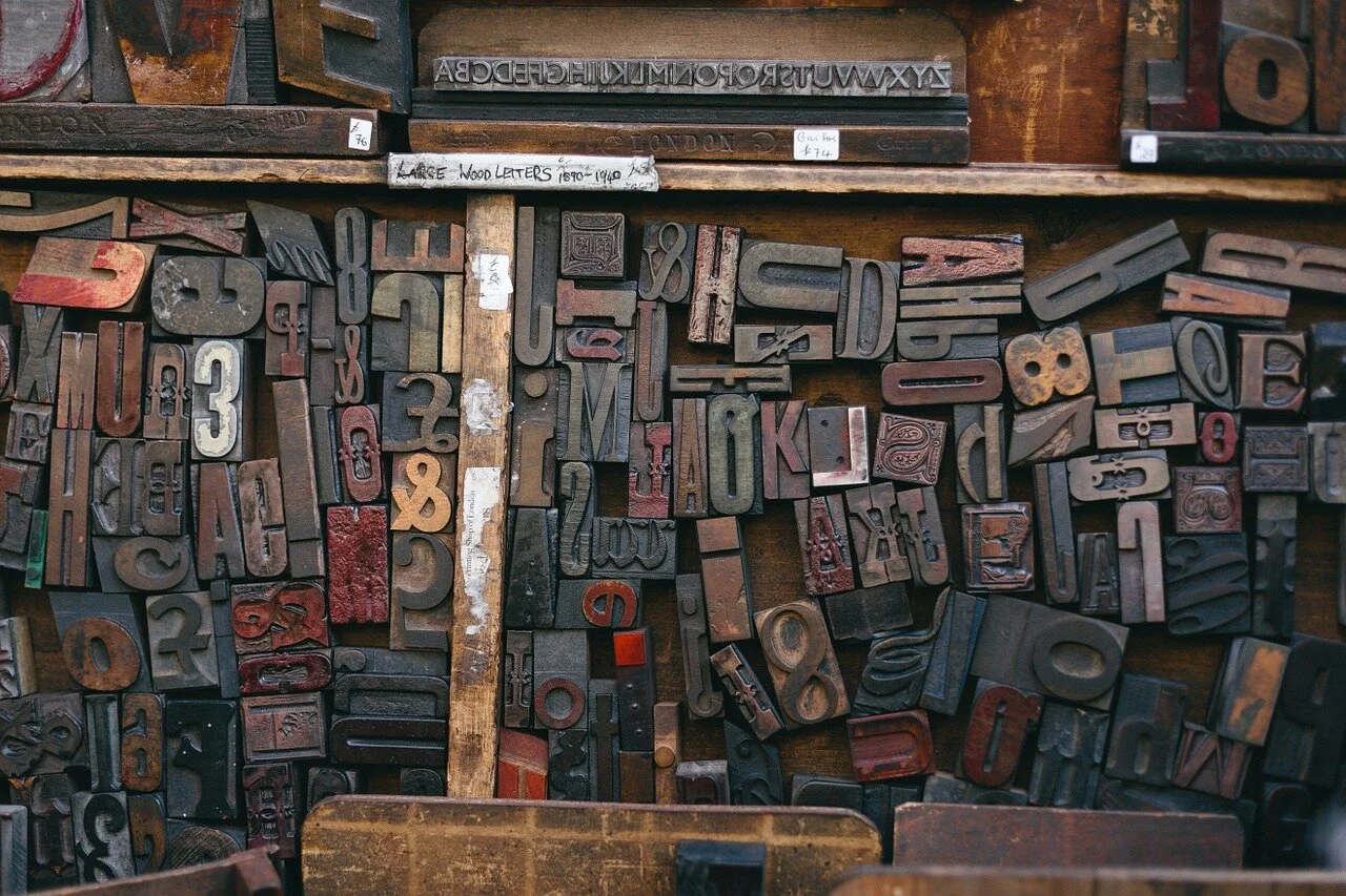
You see, a good pair of glasses is like a good typeface. Useful. Possibly sexy. Quite often cheap. Image-changing. And before you put your promo CD in the hands of any A&R guy, or point any unsuspecting music listener in the direction of your website, you need to ensure that you’re using the right fonts on both. That may sound like a ridiculously cautious approach – or overly-reverential of fonts – but there are some very good reasons for ensuring you’ve got your typeface selection right before you unleash your music on an industry contact or a member of the great unwashed.
Firstly, the typeface you use on your promotional material is one of the biggest clues about the kind of music you make. Say, for example, you are in a band called The Folk Poppers and you make polite folk pop. The drummer in the band says he knows a thing or two about graphic design, and he duly whips up a logo using a typeface called Squealer, which is rather reminiscent of the font-du-choix of AC/DC. Not knowing any better, you plaster this all over your album sleeve, your posters, your website and your e-newsletters. In doing so, you become a hard rock band before anybody’s even heard your CD full of tasteful folk-pop ditties. This of course means that you now run the risk of having to deal with some seriously confused hard rock fans who are absolutely disgusted by your CD; and worse, you might never reach the eardrums of those who are into polite folk pop, because they took a look at your album cover and assumed you were a hard rock band.
Secondly, a font can instantly tell an industry contact or potential listener how professional you are as an outfit (and thus how seriously to take you). For example, if you design promotional material that makes extensive use of Comic Sans, you immediately come across as amateurish. Your tracks may sound great – recorded with vintage analogue synthesisers run through valve pre-amps that only accept inputs from cables that end with quarter-inch jacks made of gold – but if the song titles are presented in Comic Sans, well, seriously, you’re screwed. That’s the kind of font that mums and dads get the pleasure of seeing when they receive a newsletter from a playgroup. It screams ‘small time’. Childish. Local. Unambitious. Not very rock and roll. And ultimately unworthy of further exploration. (Note to any kindergarten-users or proprietors amongst you: it’s fine, however, for playgroups to use it; probably quite appropriate).
It all comes down to this: in showbiz, preconceptions are everything. And typefaces are actually one of the earliest generators of these preconceptions. Like band photos, they technically don’t have anything to do with the kind of noise your band makes – but they sure as hell make people think they know what you sound like, without you ever playing a note.
So, given all the above, how do you actually get your band typeface right? Here are some tips:
- Before you start thinking about fonts, think about your music. What kind of noise do you REALLY make? Try to nail down the genre as best you can as this will eventually inform your typeface choice. (This can be surprisingly difficult in these post-post-post-modern days of ours, but try your best.)
- Do some research. Look at the typefaces used by bands that operate in the same genre as you and compile a list of potential fonts that get your act into the right ‘font ballpark’.
- Use tools like Myfonts.com to see what your band’s name looks like in a particular typeface (just whack your act’s name into the ‘sample text’ box above font search results). If you see another band using a particular font, and are minded to nick it, you can also use Myfonts.com’s “What the Font” tool to find out what the name of that typeface is (by uploading a screengrab of it).
- Once you’ve decided on a particular typeface, gauge opinion on it – ask some music industry professionals, your Facebook fans, etc. what they make of it, and if they think it 1) suits the sort of music you play and 2) looks professional.
- Remember that if you want to use a particular font for general body copy on a website, there must be a ‘web font’ version of it available. However, if you are particularly keen on a using a typeface for your band name, but there isn’t a web font version available, you can just convert the band name text to a graphic – for use in headers and so on – and use a similar / complimentary webfont for general text on the site. (A good source of free web fonts is Google Fonts).
- If you feel in any way out of your depth with typefaces, do consider getting a graphic designer on board – and preferably one that regularly works with bands (rather than one who does corporate stuff – you don’t want to end up with your band’s name looking like the Barclay’s logo or similar).
And finally, remember this above all else: there is nothing funny about Comic Sans. Even if you are in a comedy band that sings extremely jovial songs, it is still worth avoiding like the plague.
About The Prescription
‘The Prescription’ is written by independent musician and Head of Digital Communications and Irish PR at Prescription PR, Chris Singleton.
Find out how Prescription PR can get your band noticed - contact us today. We offer music PR, digital marketing and music web design services.
Don’t miss great free music promotion advice from Prescription PR
- Get our music industry advice articles in your inbox
- Follow Prescription PR on Facebook
- Follow Prescription PR on Twitter
- Find out more about Prescription PR, a leading UK music PR and band promotion agency - visit our website.